Winners
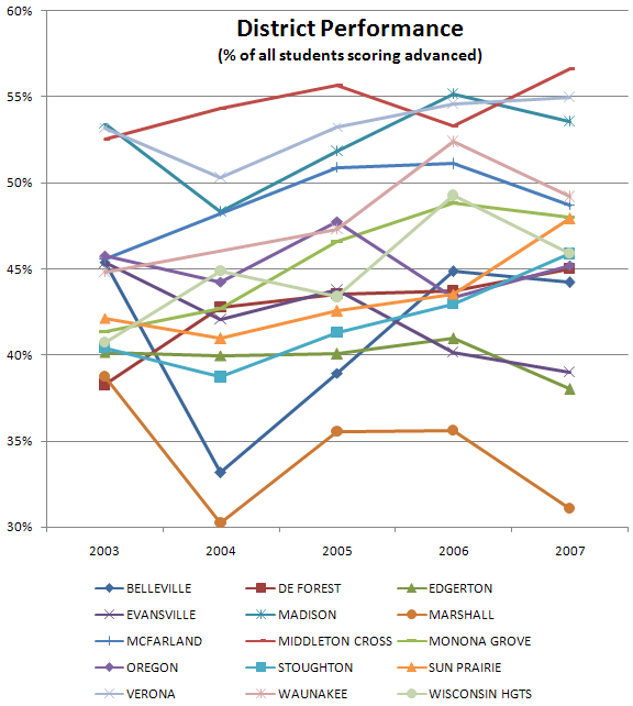
I think the clear winners really are Madison, Middleton-Cross Plains, and Verona. I say that because their score lines sit above the rest in a sort of little group. They cross each other but not any of the lines below. And you can see how they're clustered at a high level in both 2006 and 2007.
Trends
One thing this graph shows is how districts are faring over time. 5 years isn't a long time but there seem to be a few trends (or non-trends as the case may be). I did a linear regression on the data points which may or may not be valid but it's better than eyeballing and actually contradicts eyeballing in several cases.
The district making the most progress with regard to increasing scores is Monona Grove. I think that's pretty evident in the chart. Of course starting low makes that easier, right?
The district making the worst progress is Evansville which is making a relatively steep descent. The only other districts heading down in scores are Oregon (very slight), Marhsall and Edgerton.
Sun Prairie is heading upward pretty well also. The rest of the districts are heading upward at a fairly slow pace and you can see that on the chart.
Test Quality
I'm sure the test creators analyze their test quality to no end but there doesn't appear to be a clear simultaneous bump up or bump down for any particular year. I would expect, if the tests were poorly designed, that one year might be easier than another and you'd see all districts going up and down simultaneously. Not so, apparently.
No comments:
Post a Comment