What's happening with Madison elementary schools over time?
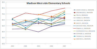
Well, it's not that clear. The first graph below shows west-side elementary schools progress over time with respect to my measurements. It does sort of seem they are doing better. Generally speaking the lines trend upward especially in the 2007 data point. The way they all trend upward for 2007 makes me think there is something not comparable between the 2007 and 2006 tests.
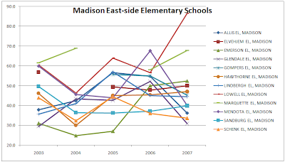
The second graph shows east-side elementary schools. It's a lot more zig-zaggy than the west-side ones. Three, in particular, really shoot down for 2007: Sandburg, Mendota, and Glendale. I wonder why that is? Those are precipitous drops. Looks to me like you want your kids at Lowell or Marquette which really seem pretty good on this chart (and, of course according to the table in my previous post).


No comments:
Post a Comment