Tuesday, November 25, 2008

Middle Schools in 2008

If you recall your middle school years, I think you know how critical that particular period is to your educational future. Well at least that's what I recall from the days of yore where your "track" was decided in middle school.

Even if that's no longer the case, in middle school you're forming your peer group that, most likely, you will be with through high school.

Long story short, Madison Metro has the best middle schools. As you can see in the table, the top 5 schools are MMSD.


If you look at the statewide data, you'll see that not only are Spring Harbor, O'Keeffe and Hamilton the top 3 in Madison, they are #3, #4 and #5 statewide. These public schools are bested only by the ALPs charter school in Oshkosh and Swallow Elementary in Hartland.

Not to deny Cherokee and Jefferson their due as #19 and #20 statewide of course.

Of course it's not all golden for the MMSD because the bottom 4 area schools are ALSO MMSD schools. In fact, Sherman is quite terrible sitting in the 10th percentile down there; 47th from the bottom statewide. About the only thing you can say is that it's better than some of the, no doubt, awful Milwaukee public schools.

I'm sure the MMSD digs into this all the time but I would really like to understand why theoretically similar demographics should result in wildly different scores. For example, the O'Keeffe and Sherman attendance areas are adjacent. Yet one is #4 statewide and the other #425 statewide.

Most of the schools appear to be fairly consistent year-to-year but it looks like Savanna Oaks in Verona dropped precipitously from #3 in the area to #12 in the area. I wonder why?

And despite the recent problems at Toki, it's doing a pretty good job still.

Friday, November 14, 2008

New data are here! New data are here!

I'm reminded of the scene in The Jerk where Steve Martin gets overly excited about finding his name in the new phone book.

Apparently I'm just as much of a dork about new school performance data but only half as coked up...

So the new data was finally released and I processed it through my spreadsheet thingy. You can see the data for Madison area elementary schools below.

Somewhere in this blog you can find my methodology but basically the idea is to compare apples to apples. In school terms, based on the available data, that's comparing children of similar economic backgrounds. To that end, I have selected only data from students that are non-economically disadvantaged.

The score figure listed is the average percent of students scoring "advanced" across all WKCE tests (math, reading, social studies, science, etc.). My intention is to rank schools by a single figure.

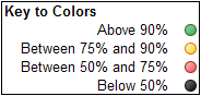
The percentile figure listed is the percent of schools across all of Wisconsin that the listed school is better than. For example, Falk Elementary has a better score than 81% of all other Wisconsin schools. The color is just to give you a visual picture of those percentiles.


It comes as no surprise compared to my previous analyses that Madison Metro has the best and worst schools.

I was curious to see how individual schools go up and down quite dramatically. I had analyzed this before in a previous post and the variability seems to continue.

Again take note that of the top 10 schools on this list, 8 are Madison Metro schools. Surprisingly, Nichols Elementary in Monona is up there. Movin' on up, to the eastside...

It's fun to note that not only is Van Hise in the 100%-th percentile, it is actually the #1 elementary school in Wisconsin based on my calculations. Randall Elementary comes in at #3 statewide. 7 of the top 25 elementary schools in Wisconsin are MMSD schools!

On the other hand, there are some SORRY performances by MMSD schools. Lindbergh being the worst waaaay down in the 14-th percentile. I'm a supporter of schools but when what should be the same group of students performs at #1 in Wisconsin in one school and #663 in another, the heat needs to come down somewhere. Really, would you have us believe that the Lindbergh students are uniquely that terrible? Some of it may fall on the parents but a 50% difference on test scores cannot be attributed to them alone.

I reiterate my statement that educational quality comes down to tiny geographic areas served by individual schools. Perhaps it's socio-economic to a large degree given the wealth differences that are also geographically based but who really knows...

Monday, October 22, 2007

Size Doesn't Matter (in Madison)

As a fan of smaller schools, much as it pains me to write, I find that with respect to student performance, the size of the school does not matter at all. At least in Madison.

After reading this article from the WSJ, I became curious about the expert's statement that "Research so far, Odden said, fails to show a clear link between achievement and school size, particularly within the range of sizes in Madison." Frankly, I didn't believe him.

So I dug into the data and, it turns out, given the limited amount of data I used, it seems there is absolutely not correlation between school (or in this case, class) size and test performance.

Now that is not to say small schools should be eliminated. There are other positive attributes of small schools that I have not measured here. I'm only looking at (as I've referred to many times) the average total percentage of non economically disadvantaged students who achieve in the "advanced" score category for the statewide tests.

First try - Positive Correlation

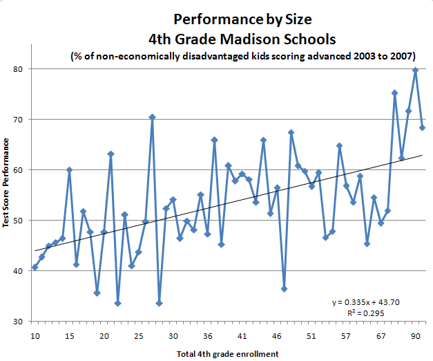
Here's my first analysis. You can see what looks like a mild correlation between 4th grade class enrollment and performance. That is, the larger the school, the better the performance. It's pretty zigzaggy and the R-squared value is .295 which isn't exactly highly correlated but it is somewhat correlated.

Then I began to think, hmm... the newer schools are bigger and they tend to be in more affluent areas hence we might be seeing simply a correlation to location rather than really to size. Hence my next analysis.


Right Try - No Correlation

What I figured is that the test scores had to be normalized somehow to the school itself. We can't compare a big new suburban Madison school to an old urban school, right? We really can only properly compare scores within a school to itself.

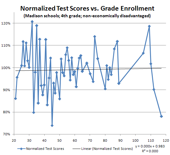
Fortunately class sizes change within schools. So what I did was normalize the test scores to the schools' average test score. So the graph below shows test scores as percentages above or below the individual school's average plotted against the 4th grade enrollment.

E.g. a point at a grade enrollment of 30 with a value of 120% indicates that for some school having an enrollment of 30, they had a test score that was 20% higher than their average test score.

You can see now that the correlation (via the R-squared) is exactly 0.0. There is no relationship between school size and test performance.


Wednesday, October 17, 2007

School District Shoot-out

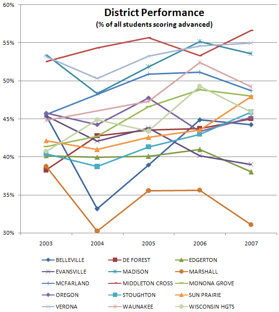
Oh alright, I shouldn't have entitled this a "shoot-out" I guess but that's what I'm calling an over time comparison of the local districts. The comparison shown below shows, for each district and year, the percentage of non-economically disadvantaged students across all grades and all tests scoring advanced.

Winners

I think the clear winners really are Madison, Middleton-Cross Plains, and Verona. I say that because their score lines sit above the rest in a sort of little group. They cross each other but not any of the lines below. And you can see how they're clustered at a high level in both 2006 and 2007.

Trends

One thing this graph shows is how districts are faring over time. 5 years isn't a long time but there seem to be a few trends (or non-trends as the case may be). I did a linear regression on the data points which may or may not be valid but it's better than eyeballing and actually contradicts eyeballing in several cases.

The district making the most progress with regard to increasing scores is Monona Grove. I think that's pretty evident in the chart. Of course starting low makes that easier, right?

The district making the worst progress is Evansville which is making a relatively steep descent. The only other districts heading down in scores are Oregon (very slight), Marhsall and Edgerton.

Sun Prairie is heading upward pretty well also. The rest of the districts are heading upward at a fairly slow pace and you can see that on the chart.

Test Quality

I'm sure the test creators analyze their test quality to no end but there doesn't appear to be a clear simultaneous bump up or bump down for any particular year. I would expect, if the tests were poorly designed, that one year might be easier than another and you'd see all districts going up and down simultaneously. Not so, apparently.


Monday, October 15, 2007

Madison Elementary Schools' Progress

What's happening with Madison elementary schools over time?

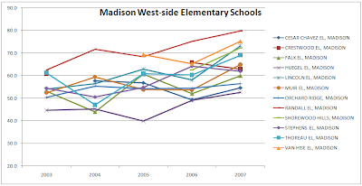
Well, it's not that clear. The first graph below shows west-side elementary schools progress over time with respect to my measurements. It does sort of seem they are doing better. Generally speaking the lines trend upward especially in the 2007 data point. The way they all trend upward for 2007 makes me think there is something not comparable between the 2007 and 2006 tests.

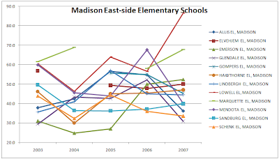
The second graph shows east-side elementary schools. It's a lot more zig-zaggy than the west-side ones. Three, in particular, really shoot down for 2007: Sandburg, Mendota, and Glendale. I wonder why that is? Those are precipitous drops. Looks to me like you want your kids at Lowell or Marquette which really seem pretty good on this chart (and, of course according to the table in my previous post).